Initial user onboarding was one of the features I’ve worked on at The Browser Company.
Our product has many exciting features, which I’ll cover in other articles in the future. Still, the thing I want to show you today is the final animation the user sees when we melt their onboarding experience into the browser.
This is what we’ll be building:
💡
As part of this tutorial, I’ve simplified the original animation we have in ARC to make it easier to understand and less magical. There was a lot of minor tweaking to get the feeling right in the Browser.
The video above is the result of this tutorial implementation.
Development Setup
I always use my workflow that enables hot reloading in Swift. It allows me to iterate quickly and without restarting the app.
Now because we’ll be using Masking in this tutorial, it’s easier to see both the masked image and the original content side-by-side. For that, I’ll set it up with HStack:
struct ContentView: View {
  @ObserveInjection var inject

  let windowSize = CGSize(width: 1280, height: 800)

  @State var tapCounter = 0

  var body: some View {
    HStack(spacing: 0) {
      let image = NSImage(imageLiteralResourceName: "Website")
      Image(nsImage: image)
        .resizable()
        .aspectRatio(contentMode: .fit)
        .frame(width: windowSize.width / 2, height: image.size.height / image.size.width * windowSize.height)
        .mask(MaskingView().id(tapCounter))

      MaskingView()
        .id(tapCounter)
        .aspectRatio(contentMode: .fit)
        .frame(width: windowSize.width / 2, height: image.size.height / image.size.width * windowSize.height)
        .clipped()
    }
    .frame(width: windowSize.width, height: windowSize.height)
    .onTapGesture {
      tapCounter += 1
    }
    .enableInjection()
  }
}
💡
I added a tap counter and used it as an id to get every tap to re-start the masking animation, better development workflow ;)
Primer on Masking
We need to create an animated mask for the onboarding layer to achieve that effect. Let’s talk about how we can achieve that.
When we create a mask, we clip all areas of the image that aren’t clear. All other locations will be visible.
Let’s say we take a Mask image like this:
var body: some View {
  ZStack {
    ForEach(0 ..< 10) { index in
      Circle().fill(Color.white)
        .frame(width: CGFloat(32 + index * 10), height: CGFloat(32 + index * 10))
        .offset(x: CGFloat(index * 20), y: CGFloat(index * 20) - 100)
    }
  }
}
And apply it to an image like this blog homepage:
Image(nsImage: .init(imageLiteralResourceName: “Website”))
  .mask(
    maskingView
  )
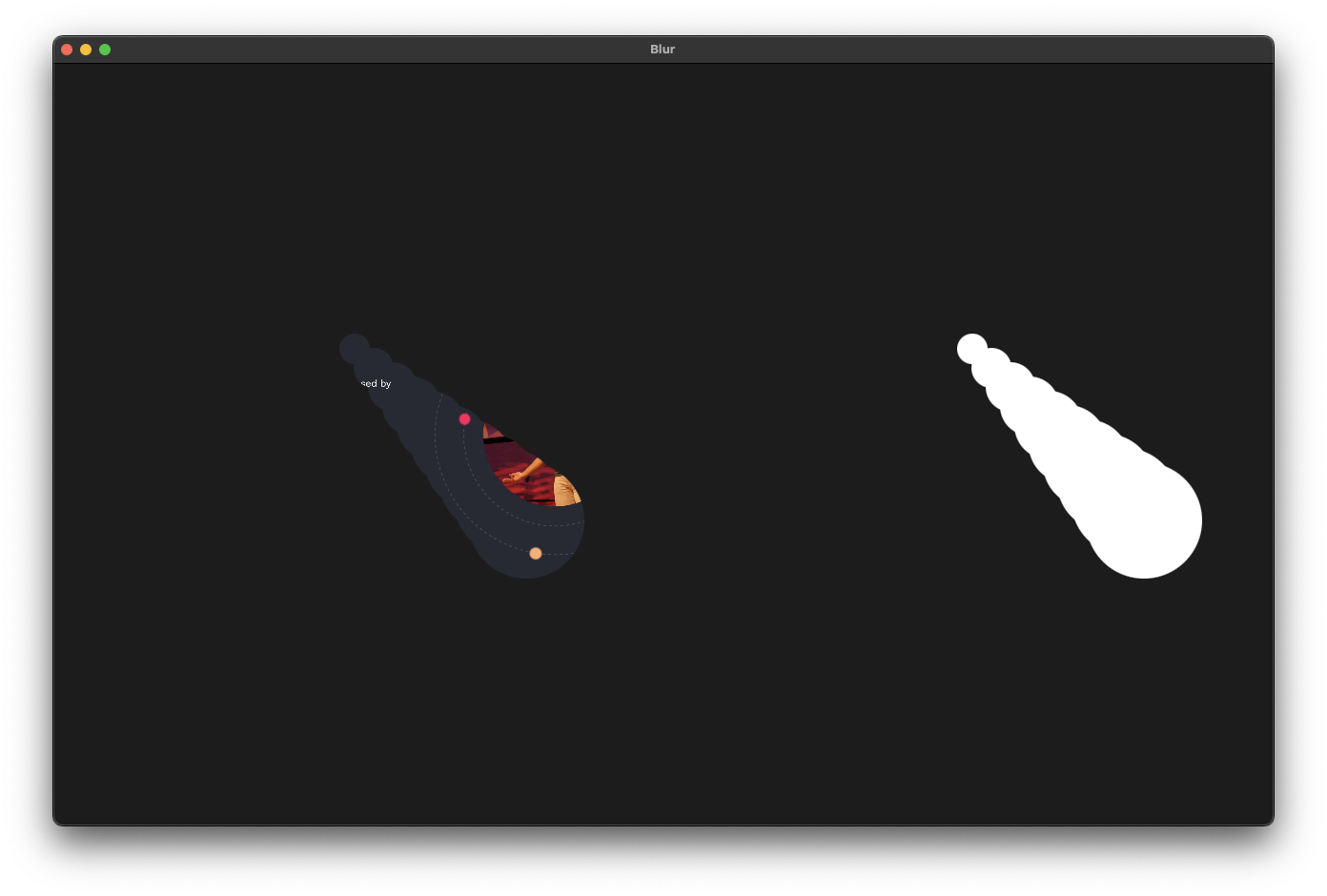
The result is this (mask on the right, applied on the left):
 Now nothing is stopping us from making the masking view animated:
- Add a
@State var xOffset: CGFloat = 0 - Apply it to the offset value for X axis
- add
animation()modifier - change
xOffsetto some value to trigger the animation
var body: some View {
  ZStack {
    let count = 10
    ForEach(0 ..< count) { index in
      Circle().fill(Color.white)
        .frame(width: CGFloat(32 + index * 10), height: CGFloat(32 + index * 10))
        .offset(x: CGFloat(index * 20) + xOffset * (count - CGFloat(index)) - 200, y: CGFloat(index * 20) - 100)
    }
  }
  .animation(.easeInOut(duration: 1.5).repeatForever(), value: xOffset)
  .onAppear {
    xOffset = 50
  }
}Building the melting effect
We want to start the masking with full white color coverage and then make it collapse on itself.
The simplest way would be to put a big circle in the center and then decrease its size:
Circle()
  .fill(Color.white)
  .frame(width: size, height: size)
  .onAppear {
    withAnimation(.easeInOut(duration: 3) {
      size = 0
    }
  }
But the effect is too plain and has no wow effect:
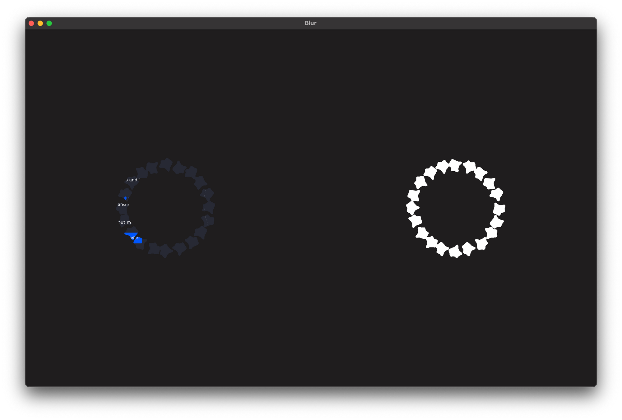
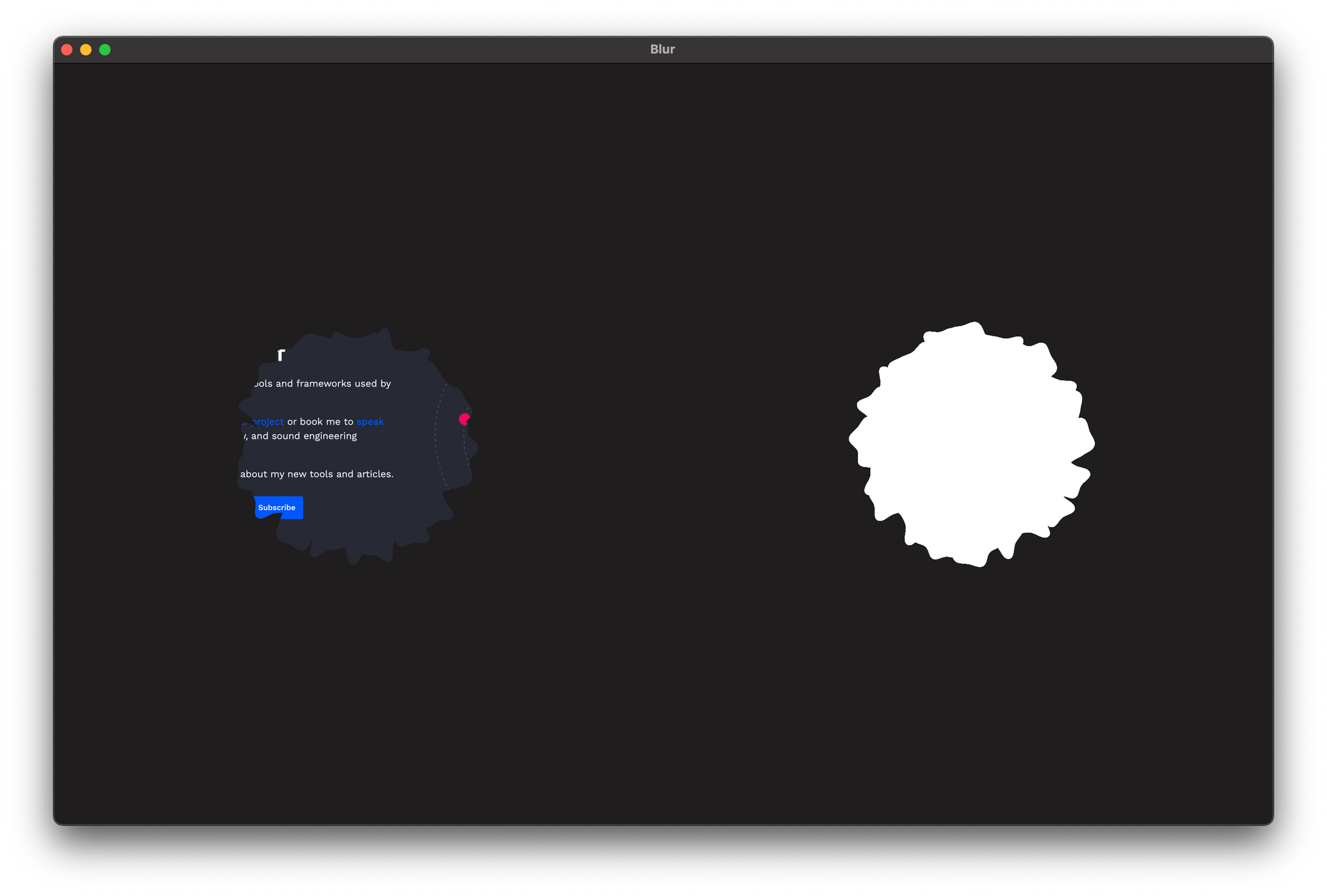
Instead, what we’ll do is place a non-uniform shape around the center of the screen:
GeometryReader { proxy in
  let count = 20
  let anglePerCircle = Double(360 / count) * .pi / 180
  let widthToHeight: CGFloat = proxy.size.width / proxy.size.height

  Circle()
    .fill(Color.white)
    .frame(width: radius * 2, height: radius * 2)
    .position(
      x: proxy.size.width / 2,
      y: proxy.size.height / 2
    )

  ForEach(0 ..< count, id: \.self) { index in
    let angle: CGFloat = Double(index) * anglePerCircle
    blob
      .foregroundColor(.white)
      .frame(
        width: size,
        height: size
      )
      .rotationEffect(Angle(degrees: CGFloat.random(in: -160 ... 160)))
      .position(
        x: proxy.size.width / 2 + sin(angle) * radius,
        y: proxy.size.height / 2 + cos(angle) * radius
      )
  }
}
And add a circle in the center of it to backfill the missing space:
Circle()
  .fill(Color.white)
  .frame(width: radius * 2, height: radius * 2)
  .position(
    x: proxy.size.width / 2,
    y: proxy.size.height / 2
  )
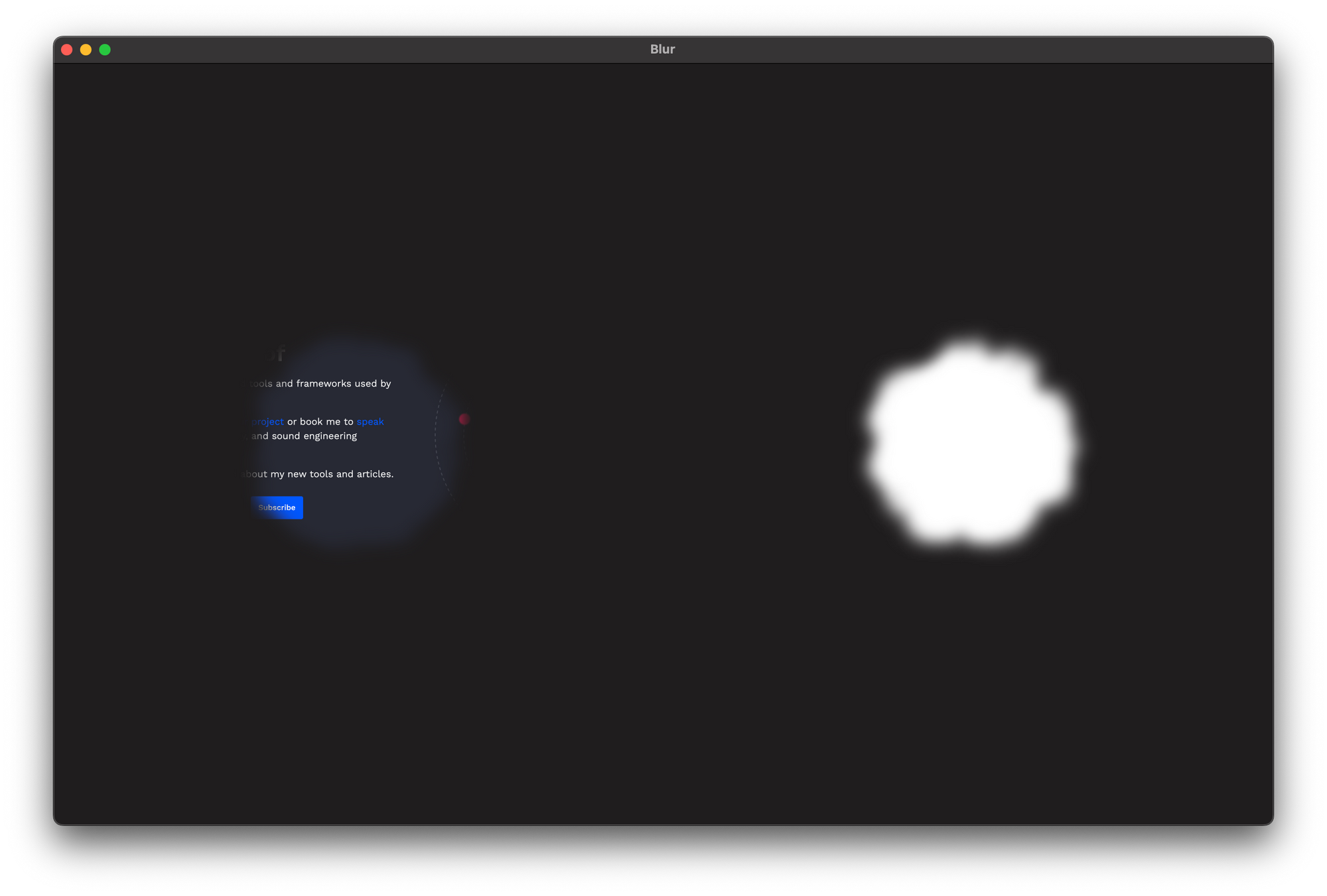
and add a
 blur(10) on the whole content:
 Then when we animate the size down, we get a far more stunning effect:
The final step is adding a logo in the center and timing the animations correctly (lots of tweaking):
assetForMasking
  .scaleEffect(1.0)
  .blur(radius: logoBlur)
  .foregroundColor(.white)
.opacity(logoOpacity)Now you could use the masking view to reveal contents underneath with a simple ZStack:
ZStack {
  Image(nsImage: NSImage(imageLiteralResourceName: "Website"))
    .resizable()
    .aspectRatio(contentMode: .fit)
  Image(nsImage: NSImage(imageLiteralResourceName: "Intro"))
    .resizable()
    .aspectRatio(contentMode: .fit)
    .mask(MaskingView().id(tapCounter))
}
And you’ll end up with the initial demo I showed in the intro.
Conclusion
We didn’t plan on this effect to be in the Browser when we started working on onboarding, but I had this idea in my head, and I thought it would be a nice transition, so when I was flying to New York, I decided to implement it.
It’s such a simple effect, yet when I showed it in the company, people loved it, and it felt just right, and the responses from the users around the whole Onboarding experience have been great!